Open access at scale — content sprawl in Highspot
Open access to everything means finding nothing fast
In large organizations, Highspot gives sales reps access to almost all content in the platform. Paradoxically, this abundance creates friction — reps spend more time searching for the right content and less time selling.
Open access at scale doesn't serve the rep or the org. The problem isn't a lack of content. It's that relevance is buried inside volume.
From spots to content collections — the organizational layer
Content Collections: grouping spots into a searchable scope
Content in Highspot lives in spots — folder-like constructs with individual access control. Every item added requires a manual decision about which spot it belongs to.
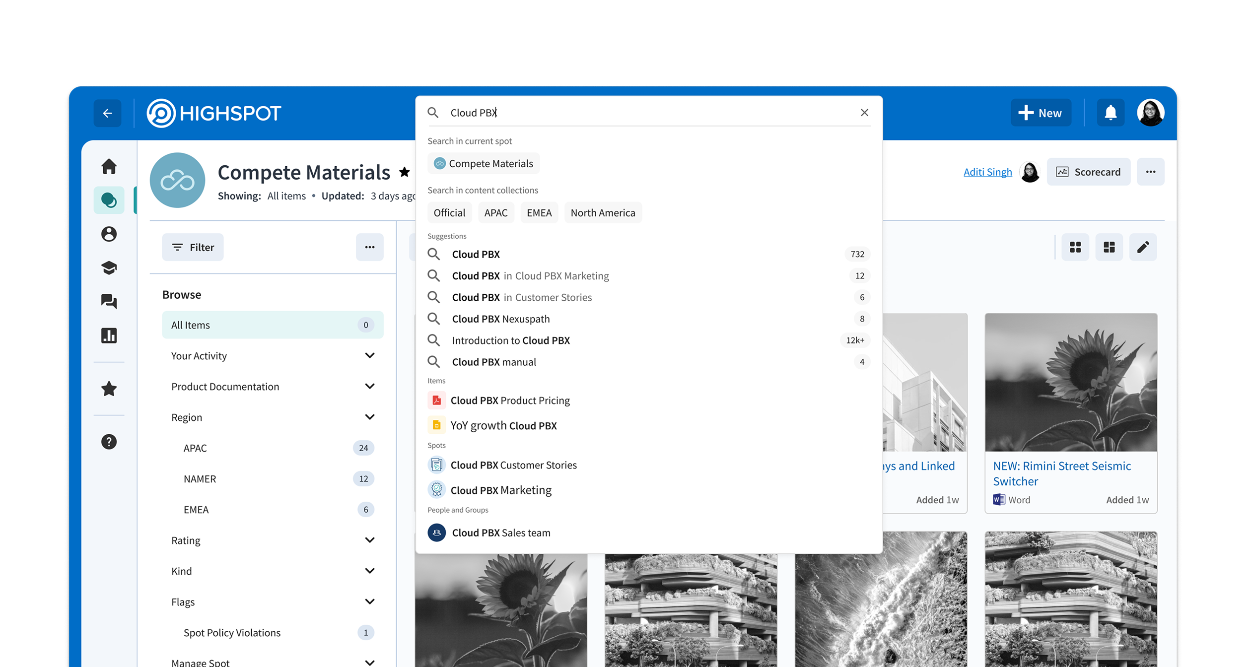
To make scoped search possible, we first introduced content collections — an admin-defined grouping of related spots. Once a collection is configured, item-to-collection association becomes automatic.
Collections map naturally to how large orgs already think: by sub-org, product line, or region. They don't replace spots — they aggregate them into a meaningful scope.
Early exploration — broad interaction patterns
The more you can scope, the harder it is to scope
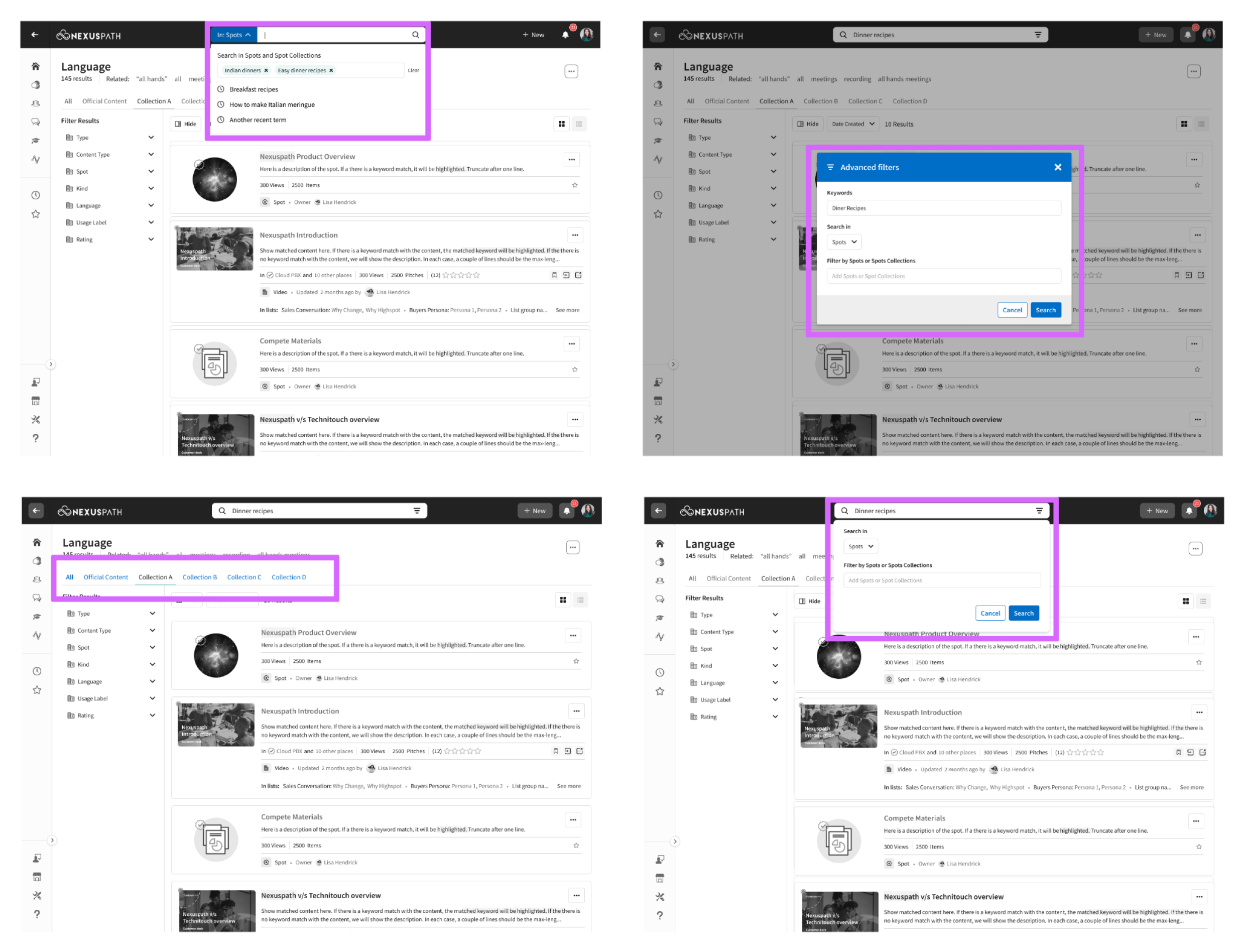
The first iteration went wide — exploring every way a user might select a collection scope before or during a search. The exploration surfaced a core tension: more collections meant more complex interaction patterns in the search dropdown.
The search dropdown is not a place for complexity. It needs to be fast and instinctive. Every additional option in that surface is friction.
We went back to customers and studied actual usage. Users either have access to 1–3 collections, or they have access to more but realistically only care about 1–3. The design problem collapsed.
Users have access to many. They care about a few.
We went back to customers with a focused question: how many Collections do users actually have access to, and how many do they realistically use?
Users had access to many collections — but would consistently engage with only 1–3. This grounded a core design principle: make frequent tasks easy, and less frequent tasks possible.
Users had access to many collections but functionally used 1–3. Surfacing every collection equally in the search dropdown would optimize for a scenario that rarely happens.
Search is a dynamic surface. Design every state, not just the default.
Interacting with search is not a single action — it's a sequence. Every keystroke, pause, and click changes what the dropdown should show. If transitions aren't fluid, the perception of speed breaks down even when results are fast.
Five states. Each with a distinct job.
We redesigned each state of the search surface from scratch — deciding what's important at each stage and how to arrange it. The transitions between them became as important as the states themselves.
The scoped variants (Scope + Zero, Scope + Auto-suggest) mirror their unscoped counterparts with a collection pill added to the bar. Removing the pill always takes you back to the plain version of that state.
Interactive prototype